Monday 27 February 2012

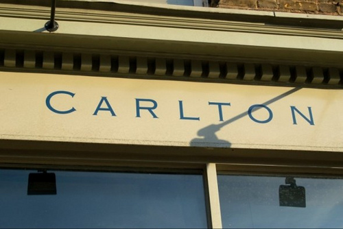
Traditional London sign painter


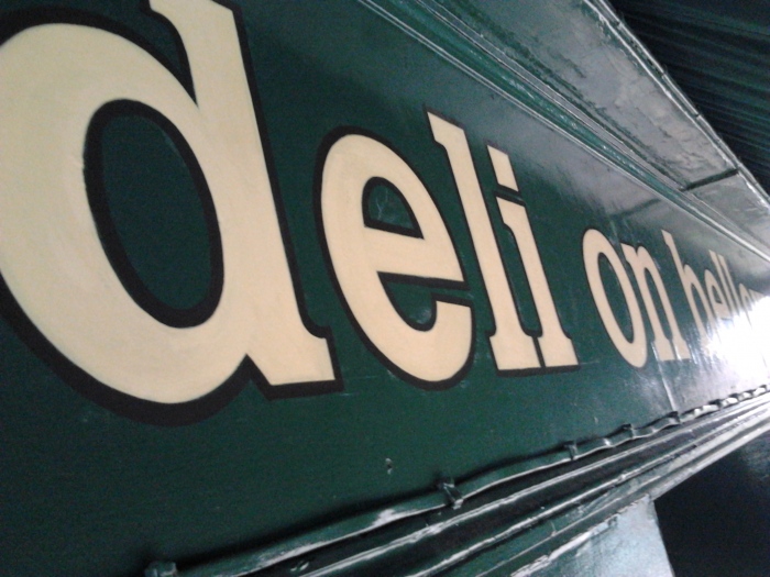
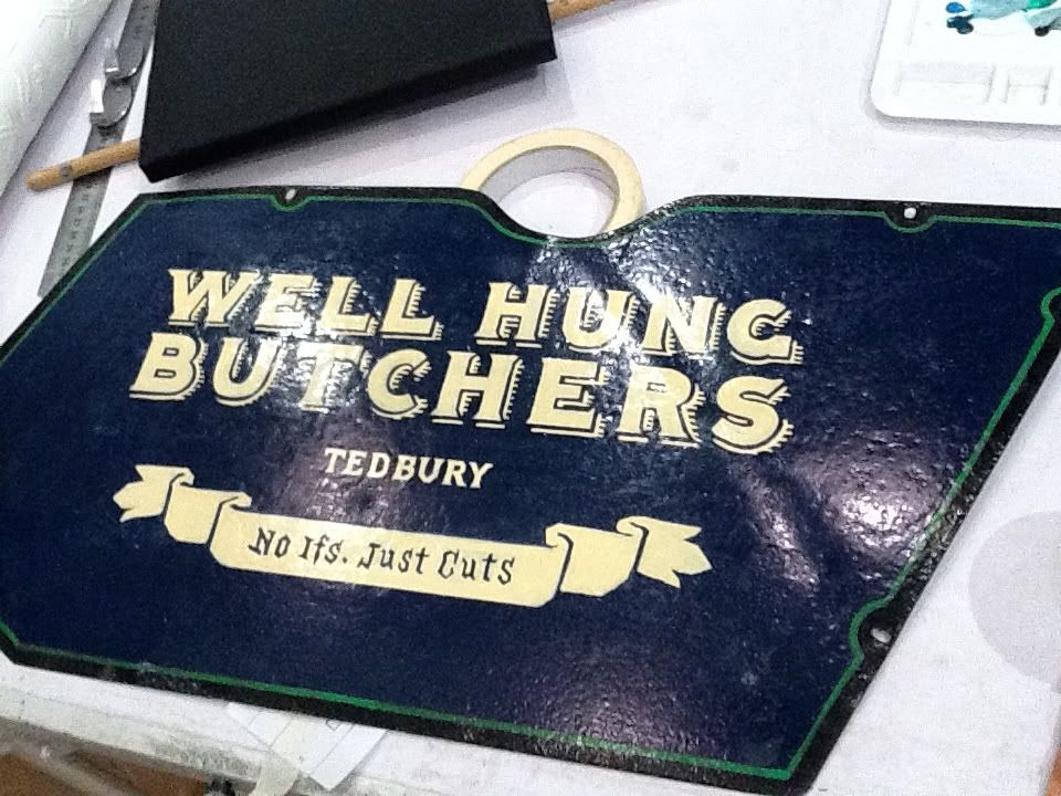
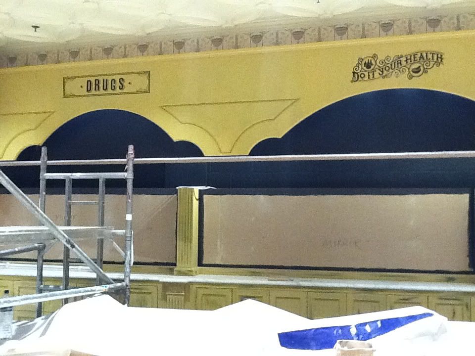
Being a signwriter today in London is very exciting... So many people and clients appreciate hand painted signs and classic artisan skills. People walk up to us in the street to pay compliments... I love that.

In an age where digital silence prevails (on trains and buses), the real charm of analogue proves to be alive and well.

People just need the excuse!

Friday 17 February 2012

Fonts: Frank Pick


back


The North Downs, 1916<br /><br /><br/>Advertising poster<br /><br /><br/>Design: E. McKnight Kauffer<br /><br /><br/>© TfL/London's Transport Museum</p><br /><br/><p>


The North Downs, 1916
Advertising poster
Design: E. McKnight Kauffer
© TfL/London's Transport Museum


Reigate, 1916<br /><br /><br/>Advertising poster<br /><br /><br/>Design: E. McKnight Kauffer<br /><br /><br/>© TfL/London's Transport Museum</p><br /><br/><p>


Reigate, 1916
Advertising poster
Design: E. McKnight Kauffer
© TfL/London's Transport Museum


Original drawing for the London Underground roundel symbol<br /><br /><br/>Design: Edward Johnston<br /><br /><br/>© TfL/London's Transport Museum</p><br /><br/><p>


Original drawing for the London Underground roundel symbol
Design: Edward Johnston
© TfL/London's Transport Museum


Harry Beck in 1965, holding one of his 1931 sketches of the diagrammatic London Underground map<br /><br /><br/>© TfL/London's Transport Museum</p><br /><br/><p>


Harry Beck in 1965, holding one of his 1931 sketches of the diagrammatic London Underground map
© TfL/London's Transport Museum


Thanks to the Underground, 1935<br /><br /><br/>Advertising poster<br /><br /><br/>Design: Zero (Hans Schleger)<br /><br /><br/>© TfL/London's Transport Museum</p><br /><br/><p>


Thanks to the Underground, 1935
Advertising poster
Design: Zero (Hans Schleger)
© TfL/London's Transport Museum


Come out to Live, Come in to Play, 1936<br /><br /><br/>Advertising poster<br /><br /><br/>Design: Paul Nash<br /><br /><br/>© TfL/London's Transport Museum</p><br /><br/><p>


Come out to Live, Come in to Play, 1936
Advertising poster
Design: Paul Nash
© TfL/London's Transport Museum


Your Fare from This Station, 1936<br /><br /><br/>Advertising poster<br /><br /><br/>Design: Laszlo Moholy-Nagy<br /><br /><br/>© TfL/London's Transport Museum</p><br /><br/><p>


Your Fare from This Station, 1936
Advertising poster
Design: Laszlo Moholy-Nagy
© TfL/London's Transport Museum


Go out into the Country, 1938<br /><br /><br/>Advertising poster<br /><br /><br/>Design: Graham Sutherland<br /><br /><br/>© TfL/London's Transport Museum</p><br /><br/><p>


Go out into the Country, 1938
Advertising poster
Design: Graham Sutherland
© TfL/London's Transport Museum


Original Diamond Diagonal - Chevron,  c.1938<br /><br /><br/>Design: Enid Marx<br /><br /><br/>Upholstery fabric<br /><br /><br/>© TfL/London's Transport Museum</p><br /><br/><p>


Original Diamond Diagonal - Chevron, c.1938
Design: Enid Marx
Upholstery fabric
© TfL/London's Transport Museum


Arnos Grove station booking hall after its construction in 1932<br /><br /><br/>© TfL/London's Transport Museum</p><br /><br/><p>


Arnos Grove station booking hall after its construction in 1932
© TfL/London's Transport Museum


Arnos Grove station after its construction in 1932<br /><br /><br/>© TfL/London's Transport Museum


Arnos Grove station after its construction in 1932
© TfL/London's Transport Museum


FRANK PICK


(Edited by The London Sign Writer)

Design Patron (1878-1941)
Designing Modern Britain - Design Museum
Until 26 November 2006


View print version


As head of the London Underground in the 1910s and 1920s and of the newly merged London Transport in the 1930s, FRANK PICK (1878-1941) was instrumental in establishing the world’s most progressive public transport system and an exemplar of design management.

Fonts: Verdana, Matthew Carter


British Council


Designed in Britain


back

Matthew Carter


Matthew Carter


Shelley Script typeface, 1972 Matthew Carter


Shelley Script typeface, 1972
Matthew Carter


Galliard typeface, 1978 Matthew Carter


Galliard typeface, 1978
Matthew Carter


Bell Centennial typeface, 1978 Matthew Carter


Bell Centennial typeface, 1978
Matthew Carter


Elephant typeface, 1992 Renamed Big Figgins, 1998 Matthew Carter


Elephant typeface, 1992
Renamed Big Figgins, 1998
Matthew Carter


Mantinia typeface, 1993 Matthew Carter


Mantinia typeface, 1993
Matthew Carter


Big Caslon typeface, 1994 Matthew Carter


Big Caslon typeface, 1994
Matthew Carter


Skia typeface, 1994 Matthew Carter


Skia typeface, 1994
Matthew Carter


Walker typeface, 1995 Matthew Carter


Walker typeface, 1995
Matthew Carter


Verdana typeface, 1996 Matthew Carter


Verdana typeface, 1996
Matthew Carter


Miller typeface, 1997 Matthew Carter


Miller typeface, 1997
Matthew Carter


Yale typeface, 2004 Matthew Carter


Yale typeface, 2004
Matthew Carter


MATTHEW CARTER


THE LONDON SIGN WRITER


Typography Designer (1937-)
Designing Modern Britain - Design Museum Exhibition
Until 27 November 2005


[caption id="" align="alignright" width="300" caption="Image via Wikipedia"]Specimens of typefaces by Matthew Carter.[/caption]

View print version


The most important typography designer of our time, MATTHEW CARTER (1937-) is one of the few designers whose work is used by millions of people every day. Having devoted the first half of his career to typefaces for use in print, such as Miller and Bell Centennial, he then pioneered the design of fonts for use on screen, notably Verdana for Microsoft.

After leaving school, Matthew Carter spent what was intended to be his gap year at the Enschedé type foundry at Haarlem in the Netherlands learning how to making type by hand; that is, carving the steel characters that would be punched into copper matrices for the casting of lead type. This process was more or less commercially obsolete, and most Enschedé interns spent their year working around the various departments of the printing works. Carter’s decision to remain in the type foundry gave him a peculiarly intense vocational training that was in some ways anachronistic.

Half a century later Matthew Carter is not only the most successful, but also the archetypical contemporary typographer in his embrace of what he describes as the “wonderful pluralism” in the setting of text for print and the screen.

Born in London in 1937, Carter was introduced to type by the work of his father, a typographer, book designer and type historian. Five years after his arrival at Enschedé, he made a visit to New York, which set in motion his transition from a type-maker to a type designer. Amazed by the progressive, creative typographic compositions of Herb Lubalin, Milton Glaser and other luminaries of New York’s commercial art scene in 1960, Carter returned London, a city in which no contemporary sans serif type was yet available to their London counterparts.

Carter eagerly worked with Alan Fletcher, Colin Forbes, Bob Gill, Derek Birdsall, David Collins and other 1960s heroes of Britain’s fledgling graphic design industry to produce several sans serif faces, including one for the new terminal at Heathrow Airport. After a few years as a freelance typographer in London, he moved to a job at Mergenthaler Linotype in New York designing new typefaces for photocomposition, including Snell Roundhand – a script that perfectly illustrated the comparative virtues of photosetting.

After moving back to London in 1971, he worked for ten years as a freelance designer continuing to produce designs for Linotype companies. It was during this period that he designed Bell Centennial, the typeface commissioned in 1974 by the telecommunications company AT&T, with an outstandingly exacting technical brief, for its telephone directories and which is still in use.

In 1981 Carter and three colleagues left Linotype and founded the type design company Bitstream in Cambridge, Massachusetts. While revenues from the sale of typesetting equipment were dwindling, they recognised a business opportunity in the design and sale of type itself. Bitstream developed a library of digital type – including Carter’s own 1987 design, Bitstream Charter – which could be licensed for use by anyone. Bitstream was highly successful during the 1980s when digital design and production, desktop publishing and personal computer use became virtually universal in the Western world.

Concerned that the business and marketing concerns of Bitstream left little time for design, Carter left in 1991 to form Carter & Cone Type with Cherie Cone. The 1990s were confident and creative years. In 1993, he designed Sophia and Mantinia, a display companion to his earlier face Galliard. Wrigley, designed for Sports Illustrated, was described by the art director as “an Egyptian [slab serif] with a 90s feeling”, nicely alluding to Carter’s ability to combine classic qualities with a contemporary aesthetic. Three leading news publications – Time, Newsweek and US News & World Report – commissioned Carter with no fear of conflict of interest. This phenomenon demonstrates the truth of Carter’s sense of his role as an artisan, creating letters that satisfy a publication’s needs of authentic authorial expression, word count and printing technique. The magazines knew they were not commissioning a designer with a detectable style but a profoundly skilled craftsman responding to unique circumstances.

As one of the last people to have learned the art of making metal type by hand, Carter knows letters with greater intimacy than most; not just the form of the letter but its counterform, the whole volume of space occupied by the letter, as well as the implications for the space it shares with the next letter and the whole combination of letters on a page. Carter has compared the design process to knitting: beginning with an h and an o, which give the height of ascending strokes and the curves, and applying the decisions made about these “control” characters to the rest of the alphabet. Meanwhile, he cites the laser-printer as the most revolutionary technological innovation available to his trade. “Quality is got at the proofing stage” he says, and confesses to burning up reams of paper “in the passage from the ridiculous to the sublime” which unites all creative endeavour. “For the first time in 536 years a type designer could see what he or she was doing”.

Carter’s outstanding knowledge of type and its history has not led him to be fastidious or conservative in his attitude towards the democratisation and instability of type in the digital environment. Rather the opposite: Carter has said of the early 1990s plethora of typographic experiment, particularly from schools like Cranbrook and CalArts, “I can’t think of any period in the history of typography when I would rather have been at work”. A degree of pastiche implied by the names he gave his adaptations of classic typefaces like Bodoni (Postoni) for the Washington Post and Walbaum (Wiredbaum) for Wired are clues to this absence of prejudice. But where the artisan Carter seems most uninhibited and radical is Walker, his 1995 proprietory typeface for the Walker Art Center in Minneapolis.

In response to the Walker Center’s eclectic approach to visual language, performing arts and media, Carter proposed not a logo, but a family of characters with variant horizontal rules and five varieties of “snap-on” serif. Carter was privileged to design Walker in a “controlled environment” working with a sympathetic in-house design team eager to try out the typeface in endless studies during its development. By a process that evokes the apparently self-generating proliferation and patterning of digital data, Walker anticipates complexity and inflection in a way that absolutely defined its chaos-theory-influenced time. One of the design team commented enthusiastically: “You’re not typesetting a font; the font is created in the process of designing a piece”.

The tractability of any typeface to express an authentic authorial voice has been the pre-occupation of designers since the advent of the Macintosh in the 1980s. Carter has noted a predilection among his post-graduate students at Yale for digitising handwriting – surely in pursuit of this visual and personal autonomy. Walker, meanwhile, shows Carter knowing and exercising the potential of type to express thought, language and cultural feeling with great immediacy. This is hard, he says, when “the font we have come to accept is too small”, conventionally lacking a full set of characters including not only different weights and an italic, but ligatures, small capitals, lower-case figures and distinct alphabets for titling and body text.

Galliard, designed for Mergenthaler Linotype in 1978, has all of these. It was based on Robert Granjon’s forms of the mid-16th century, discovered during Carter’s research at the Plantin-Moretus Museum in Antwerp in the 1950s and later designed for photocomposition at Mergenthaler. The exceptionally full character set of Galliard allows a text to be completely structured, with its argument physically explicit, and has made Galliard a publishing industry standard for academic books, journals and art catalogues. Meanwhile, Carter welcomes the new OpenType font format which now makes almost infinite character sets possible.

In the early years of the 21st century, Carter’s work has become so ubiquitous as to represent a sort of anonymity. North Americans look up names in Bell in the telephone book; on both sides of the Atlantic the news is read in Miller; and the whole world reads from the Web in Verdana – the typeface commissioned by Microsoft for the electronic screen which has been issued in uncountable millions of copies and is the elegant gatekeeper of a huge proportion of information.

© Design Museum + British Council

BIOGRAPHY

1937 Born in London. Introduced as a child to type by the work of his father, Harry Carter, a typographer, book designer and type historian.

1955 Accepted at Oxford University but unable to start until the following year he begins an internship at Johannes Enschede en Zonen, typfounders and printers, Haarlem, Netherlands to study punchcutting for a year. Visits the Plantin-Moretus Museum in Antwerp where he assists Harry Carter and Dis Vervliet sorting collection of 16th century punches and matrices.

1956 Decides not to take up place at Oxford University. Instead, assists Harry Carter in organising a small museum about the history of Oxford University Press

1960 While working as a freelance designer and lettering artist in London, he visits New York and meets Jackson Burke, director of typographic development at Mergenthaler Linotype in Brooklyn.

1963 As Typographic Advisor to Crosfield Electronics, agents for the Photon/Luitype photosetter, he frequently visits Deberny Peignot, manufacturers of Lumitype fonts, in Paris, and meets Adrian Frutiger.

1965 Works as staff type designer at Mergenthaler Linotype, Brooklyn, New York. The best known design from his six years there is the script face designed for photosetting in 1966, Snell Roundhand.

1971-81 Works as freelance type designer in London for Linotype companies in the US, Germany and the UK.

1977 Becomes Senior Critic at Yale University School of Art in the Graphic Design MFA programme. Carter holds this position today.

1978 Completes a four year project to Bell Centennial which was commissioned by AT&T with an outstandingly exacting technical brief specifically for use in US telephone directories, where it is still used today. Designs Galliard, which was influenced by Robert Granjons’ 16th century type designs, and quickly became a publishing industry standard.

1980 Appointed typographical advisor to Her Majesty’s Stationery Office, London & Norwich, England – a post he held until 1984.

1981 Co-founds the digital type company Bitstream, Inc. in Cambridge, Massachusetts, with Mike Parker, Cherie Cone and Rob Friedman, as vice-president and director responsible for design standards. Among the most successful designs is Bitstream Charter, with its exceptionally full character set.

1991 Leaves Bitstream to co-found Carter & Cone Type, Inc. in Cambridge, Massachusetts, with Cherie Cone.

1994 Designs Verdana for Microsoft in answer to the challenges of on-screen display and to recognise the characteristics of pixel- rather than pen-rendering.

1995 Designs Sophia for the Museum of Fine Arts, Boston influenced by lettering on a Roman chalice in the Museum’s collection, and Walker, the mutable typeface for the Walker Art Center in Minneapolis.

1997 Designs Miller, based on 19th Century Scotch Roman faces. It becomes a popular choice for newspapers including the UK’s The Guardian.

2002 Typographically Speaking: The Art of Matthew Carter opens at the University of Maryland Albin O. Kuhn Gallery, Baltimore.

2004 Designs Yale, a signage typeface for Yale University, and refines the typeface for the identity of the Museum of Modern Art, New York.

© Design Museum + British Council

FURTHER READING

Margaret Rey, Typographically Speaking: The Art of Matthew Carter,
Albin O. Kun Library & Gallery, University of Maryland, Baltimore County, 2002

Ken Shulman, Matthew Carter: Man of Letters, Graphis 325, January/February 2000

J Abbott Miller, Matthew Carter: Gentleman Typographer, Graphic Design USA: 17

Moira Cullen, The space between the letters, Eye, Vol. 5, No. 19, Winter 1995

Erik Spiekermann, Reputations: Matthew Carter, Eye, Vol. 3, No. 1, 1993

Ulrich Boser, A Man of Letters, US News & World Report, Vol. 135, No.6, September 1 2003

Visit Matthew Carter’s website at www.carterandcone.com

For more information on British design and architecture go to Design in Britain, the online archive run as a collaboration between the Design Museum and British Council, at designmuseum.org/designinbritain

© Design Museum + British Council

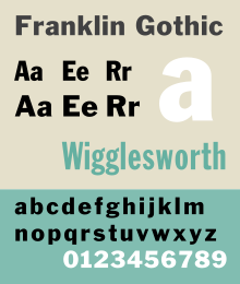
FONTS - Franklin Gothic

The London Sign Writer Nick Garrett


Long over shadowed by Gill sans and Helvetica, Franklin Gothic is now making a comeback.


Its slightly grave graphic profile and retro appeal is now creating a cool option for type setters, designers and creatives.

FranklinGothicSP.svg


History


Franklin Gothic and its related faces are realist sans-serif typefaces originated by Morris Fuller Benton (1872–1948) in 1902. “Gothic” is an increasingly archaic term meaning sans-serif. Franklin Gothic has been used in many advertisements and headlines in newspapers. The typeface continues to maintain a high profile, appearing in a variety of media from books to billboards. Despite a period of eclipse in the 1930s, after the introduction of such European faces as Kabel and Futura, they were re-discovered by American designers in the 1940s and have remained popular ever since.


In 1979, under license with ATF, Vic Caruso began work on more weights of the design for ITC. This version adheres closely to the subtle thick and thin pattern of the original design; the slightly enlarged x-height and condensed proportions of the new version result in greater economy of space. This typeface is a standard choice for use in newspapers and advertising. In 1991, David Berlow completed the family for ITC by creating compressed and condensed weights. ITC Franklin Gothic Compressed is designed especially to solve impossibly tight copyfitting problems, while maintaining high legibility standards. ITC Franklin Condensed provides medium weights of narrow proportions. It is frequently seen in newspapers, advertisements, posters, and any place with space restrictions.

NGsp4.svg

Menu Names And Style Linking

In many Windows® applications, instead of every font appearing on the menu, fonts are grouped into style-linked sets, and only the name of the base style font for a set is shown in the menu. The italic and the bold weight fonts of the set (if any) are not shown in the font menu, but can still be accessed by selecting the base style font, and then using the italic and bold style buttons. In this family, such programs will show only the following base style font names in the menu:

ITC Franklin Gothic Std Bk Cd
ITC Franklin Gothic Std Bk Cp
ITC Franklin Gothic Std Bk XCp
ITC Franklin Gothic Std Book
ITC Franklin Gothic Std Heavy
ITC Franklin Gothic Std Med
ITC Franklin Gothic Std MedCd

The other fonts in this family must be selected by choosing a menu name and then a style option following the guide below.


Menu Nameplus Style Option...selects this font
ITC Franklin Gothic Std Bk Cd[none]ITC Franklin Gothic Std Book Condensed
ITC Franklin Gothic Std Bk CdItalicITC Franklin Gothic Std Book Condensed Italic
ITC Franklin Gothic Std Bk CdBoldITC Franklin Gothic Std Demi Condensed
ITC Franklin Gothic Std Bk CdBold, ItalicITC Franklin Gothic Std Demi Condensed Italic
ITC Franklin Gothic Std Bk Cp[none]ITC Franklin Gothic Std Book Compressed
ITC Franklin Gothic Std Bk CpItalicITC Franklin Gothic Std Book Compressed Italic
ITC Franklin Gothic Std Bk CpBoldITC Franklin Gothic Std Demi Compressed
ITC Franklin Gothic Std Bk CpBold, ItalicITC Franklin Gothic Std Demi Compressed Italic
ITC Franklin Gothic Std Bk XCp[none]ITC Franklin Gothic Std Book Extra Compressed
ITC Franklin Gothic Std Bk XCpBoldITC Franklin Gothic Std Demi Extra Compressed
ITC Franklin Gothic Std Book[none]ITC Franklin Gothic Std Book
ITC Franklin Gothic Std BookItalicITC Franklin Gothic Std Book Italic
ITC Franklin Gothic Std BookBoldITC Franklin Gothic Std Demi
ITC Franklin Gothic Std BookBold, ItalicITC Franklin Gothic Std Demi Italic
ITC Franklin Gothic Std Heavy[none]ITC Franklin Gothic Std Heavy
ITC Franklin Gothic Std HeavyItalicITC Franklin Gothic Std Heavy Italic
ITC Franklin Gothic Std Med[none]ITC Franklin Gothic Std Medium
ITC Franklin Gothic Std MedItalicITC Franklin Gothic Std Medium Italic
ITC Franklin Gothic Std MedCd[none]ITC Franklin Gothic Std Medium Condensed
ITC Franklin Gothic Std MedCdItalicITC Franklin Gothic Std Medium Condensed Italic


Sandwich boards - London Trad Sign-writer Nick Garrett

Design and detail for A sign panel, custom made in traditional painted finishes.


Detailed up for John Pope, Carnac Signs

For more details and a competitive quote contact us

London Sign writer Nick Garrett

Thursday 16 February 2012

Great Design: Linton's Cutty Sark

Hercules Linton


Forenote

It seems strange posting an article about my great, great, great, great, Grandfather, but befitting as I feel I owe much of my design ability in his direction.

Nick Garrett

From Wikipedia, the free encyclopedia


This article needs additional citations for verification. Please help improve this article by adding citations to reliable sources. Unsourced material may be challenged and removed(July 2008)


Hercules Linton (1 January 1837[1] - 15 May 1900) was a Scottish surveyordesignershipbuilderantiquarian and local councillor, best known as the designer of the Cutty Sark and partner in the yard of Scott and Linton which built her.

Tuesday 14 February 2012

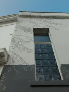
Branching out! Wow Notting Hill Mural

London signwriter Nick Garrett


London painted graphic mural

Working again with Julian Brown assisting using only traditional sign-writing materials and skills... the hand painted artwork looks great on this prestige mural artwork for Strutt & Parker Notting Hill in -5 degrees and still finishing in hot style!

Let me know what you think!

[gallery columns="4"]

Nick Garrett Traditional sign writer and muralist

Contact me for a quote

07831173396

Nickgarrett2828@yahoo.co.uk

Special thanks again to John Pope for steering this project our way.

http://johnpopesigns-gilding.blogspot.com/

Tuesday 7 February 2012

London sign-writer Nick Garrett
NGS 20 Ivymount Road, London SE27ONB

Enquiries 07831173396 

00393281518426

Fascias, shop fronts, sign panels, glass work, and gallery specialists

------------------------------------------------------------------------------------------------

Born and bred in London, I am a traditional sign writer, gilder and maker with over 30 years experience. Most of my work is in central London but I also have my family and product development studio in Italy where I develop glass gilding and various specialist products - hence the Italian mobile number.

May 1 2012 sees my new studio in 274 Queenstown Road, Battersea open, so stay posted and connect here for our regular updates.


Fantastic signwriting made by hand in the true craftsmanship tradition...


For the past 15 years I have been delivering powerful brand design.

That work looks great, Thank you. I’ve noted your other areas of expertise and I’m sure that we’ll work together in the future. Andrew Catterall, Reflect Construction UK

The execution is superb... it's very rare to see someone love what they do... Phil Monk, Head Curator, Tate Modern, London

Quality, and service are the two strengths I guarantee. But most of all I think it is always genuine creative passion that will speak volumes for your business sign acquisition.

-------------------------------------------------------------------------------------------------

Contact me for any design advice and help you may need.

nickgarrett2828@yahoo.co.uk.    desight2012@yahoo.co.uk

07831173396

Skype.  Nickgarrett2828

00393281518426

-------------------------------------------------------------------------------------------------

Sunday 5 February 2012

Hand made sign writing - Nick Garrett London based sign writer

Photobucket Pictures, Images and Photos

Sign Writing: Ted Baker new store fitout, article


by nickgarrett


Shop front Ted Baker new flagship store
Big thanks to Dave Uprichard of OPT for great layouts and TB fitters and VM designers for preparing such great artwork.

Nick Garrett Traditional Signwriting in an award winning contemporary setting…


Desight2012@yahoo.co.uk for any type of sign work - covering London and home counties.  Since 1981

Fascias  -  Glass work  -  Retail splashes  -   Galleries  -   Murals  -  images  -  and any custom specialisation you may require.